Creating Base for Frontend
So now, let’s actually start writing code to create the foundation of the frontend.
From here on, we’ll be working with the files inside the AVAX-AMM/packages/client directory. 🙌
In this step, we will delete or edit files that are assumed to exist from the initial setup. If a file to be deleted does not exist in your folder structure, simply ignore that instruction. If a file to be edited does not exist in your folder structure, create a new file and copy the given code directly into it.
📁 styles Directory
The styles directory contains CSS code.
There’s global.css, which is applied to all pages, and Home.module.css, which is for the home page.
In global.css, enter the code shown.
※ There may be cases where no edits are needed from the initial setup.
html,
body {
  padding: 0;
  margin: 0;
  font-family: -apple-system, BlinkMacSystemFont, Segoe UI, Roboto, Oxygen, Ubuntu,
    Cantarell, Fira Sans, Droid Sans, Helvetica Neue, sans-serif;
}

a {
  color: inherit;
  text-decoration: none;
}

* {
  box-sizing: border-box;
}

@media (prefers-color-scheme: dark) {
  html {
    color-scheme: dark;
  }
  body {
    color: white;
    background: black;
  }
}
Update Home.module.css with the given code.
.pageBody {
  height: 100vh;
  background: linear-gradient(
    20deg,
    rgb(49, 62, 80) 0%,
    rgb(122, 153, 182) 180%
  );
}

.navBar {
  height: 80px;
  display: flex;
  justify-content: flex-start;
  align-items: center;
  color: white;
  padding: 0px 30px;
}

.rightHeader {
  display: flex;
  padding: 5px 10px 5px 10px;
}

.appName {
  margin: 0 10px;
  font-size: 28px;
  font-weight: 800;
}

.connectBtn {
  position: absolute;
  right: 50px;
  top: 20px;
  background-color: #ff726e;
  color: #0e0e10;
  height: 30px;
  display: flex;
  justify-content: center;
  align-items: center;
  padding: 5px 10px 5px 10px;
  border-radius: 15px;
}

.connectBtn:hover {
  color: white;
  border: 2px solid #c8332e;
}

.connected {
  position: absolute;
  right: 50px;
  top: 20px;
  background-color: #4e4b56;
  color: white;
  height: 30px;
  display: flex;
  justify-content: center;
  align-items: center;
  padding: 5px 10px 5px 10px;
  border-radius: 15px;
}
The folder structure related to styles is as follows.
client
└── styles
    ├── Home.module.css
    └── globals.css
📁 public Directory
Next.js treats the public directory at the root as the location for static assets(images, text files, etc.).
This means that if you specify an image URL like /image.png in your source code,
Next.js will automatically interpret it as /project-root/public/image.png.
Delete all files inside this directory except favicon.ico.
Then add a new image.
You can either download the provided image or save any image you like as bird.png(or another name)inside the public directory.

You can also change the favicon.ico to customize your web application’s favicon.
The folder structure related to public is as follows.
client
└── public
    ├── bird.png
    └── favicon.png
📁 utils Directory
Inside client, create a utils directory.
In it, create three files: ethereum.ts, format.ts, and validAmount.ts.
client
└── utils
    ├── ethereum.ts
    ├── format.ts
    └── validAmount.ts
Please write the following code inside ethereum.ts.
import { MetaMaskInpageProvider } from "@metamask/providers";

// Add ethereum to the window object.
declare global {
  interface Window {
    ethereum?: MetaMaskInpageProvider;
  }
}

export const getEthereum = (): MetaMaskInpageProvider | null => {
  if (typeof window !== "undefined" && typeof window.ethereum !== "undefined") {
    const { ethereum } = window;
    return ethereum;
  }
  return null;
};
In TypeScript, to use window.ethereum, you need to explicitly declare that the window object has an ethereum property.
MetaMaskInpageProvider is the type definition for ethereum that you obtained from @metamask/providers when setting up your environment.
📓
window.ethereumis in order for a web application to communicate with a blockchain network, it needs to obtain the user’s wallet information.
window.ethereumis an object and API that MetaMask makes available directly underwindow(the global variable that exists by default in JavaScript). Using this API, a website can request the user’s Ethereum account, read data from the blockchain the user is connected to, and prompt the user to sign messages or transactions.
Also, by calling the getEthereum function, you can retrieve the ethereum object from window.
Please write the following code inside format.ts.
import { BigNumber } from "ethers";

// Converts to a share with PRECISION.
export const formatWithPrecision = (
  share: string,
  precision: BigNumber
): BigNumber => {
  return BigNumber.from(share).mul(precision);
};

// Converts to a share without PRECISION.
export const formatWithoutPrecision = (
  share: BigNumber,
  precision: BigNumber
): string => {
  return share.div(precision).toString();
};
Here we provide utility functions used when sending and receiving information about the contract and shares.
If you’d like to review shares again(since we stepped away from them for a bit), please visit the About Shares section in section-1/lesson-2.(It is not yet supported in English.)
As a rule, the frontend keeps shares as strings without PRECISION.
Frontend → Contract:** When sending a share to the contract, use formatWithPrecision.
Contract → Frontend:** When a share is returned from the contract, use formatWithoutPrecision to convert it.
Please write the following code inside validAmount.ts.
const regValidNumber = /^[0-9]+[.]?[0-9]*$/;

export const validAmount = (amount: string): boolean => {
  if (amount === "") {
    return false;
  }
  if (!regValidNumber.test(amount)) {
    return false;
  }
  return true;
};
Here we provide functions to validate user input.
📁 hooks Directory
Inside client, create a hooks directory.
This will contain custom hooks(customhooks) to handle wallet or contract state.
Create a file named useWallet.ts inside the hooks directory and write the following code in it.
import { useEffect, useState } from "react";

import { getEthereum } from "../utils/ethereum";

type ReturnUseWallet = {
  currentAccount: string | undefined;
  connectWallet: () => void;
};

export const useWallet = (): ReturnUseWallet => {
  const [currentAccount, setCurrentAccount] = useState<string>();
  const ethereum = getEthereum();

  const connectWallet = async () => {
    try {
      if (!ethereum) {
        alert("Get Wallet!");
        return;
      }
      const accounts = await ethereum.request({
        method: "eth_requestAccounts",
      });
      if (!Array.isArray(accounts)) return;
      console.log("Connected: ", accounts[0]);
      setCurrentAccount(accounts[0]); // For simplicity, use the first address in the array.
    } catch (error) {
      console.log(error);
    }
  };

  const checkIfWalletIsConnected = useCallback(async () => {
    try {
      if (!ethereum) {
        console.log("Make sure you have Wallet!");
        return;
      } else {
        console.log("We have the ethereum object", ethereum);
      }
      const accounts = await ethereum.request({ method: "eth_accounts" });
      if (!Array.isArray(accounts)) return;
      if (accounts.length !== 0) {
        const account = accounts[0];
        console.log("Found an authorized account:", account);
        setCurrentAccount(account);
      } else {
        console.log("No authorized account found");
      }
    } catch (error) {
      console.log(error);
    }
  }, [ethereum]);

  useEffect(() => {
    checkIfWalletIsConnected();
  }, [checkIfWalletIsConnected]);

  return {
    currentAccount,
    connectWallet,
  };
};
Here, we implement two things: checking whether the user has MetaMask and providing the ability to connect to their wallet.
connectWallet is a function that requests the web app’s access to the user’s wallet. In the next steps, we’ll add a “connect wallet” button in the UI and wire that button up to this function. For that reason, the function is included in the return value so it can be used externally.
checkIfWalletIsConnected is a function that checks whether the user’s wallet is already connected to the web app.
Also, the methods eth_requestAccounts and eth_accounts used inside each function are special methods that return either an empty array or an array containing a single account address. To account for users who have multiple accounts in their wallet, the program retrieves the user’s first account address.
The folder structure related to hooks is as follows.
client
└── hooks
    └── useWallet.ts
📁 componentsDirectory
Create a directory named components directly under the client directory.
This is where we will save files that implement components.
📓 A component is a single building block that forms part of the UI (User Interface). Components can be as small as a button or as large as an entire page. By building the UI out of component “blocks” like LEGO bricks, it becomes easier to make changes such as adding or removing features.
📁 Container Directory
First, create a directory named Container inside the components directory.
Inside it, create two files named Container.module.css and Container.tsx.
Please write the following code inside Container.module.css.
.centerContent {
  margin: 0px auto;
}

.selectTab {
  width: 460px;
  height: 80px;
  display: flex;
  justify-content: space-between;
  margin: 0px auto;
  margin-top: 10px;
  background-color: #0e0e10;
  border-radius: 19px 19px 0px 0px;
  padding: 0px 20px 0px 20px;
}

.tabStyle {
  text-align: center;
  width: 80px;
  padding: 5px;
  font: 18px;
  color: white;
  display: flex;
  align-items: center;
  justify-content: center;
  height: 30px;
  margin-top: 15px;
  border-radius: 15px;
  cursor: pointer;
}

.tabStyle:hover {
  background: #204158;
}

.activeTab {
  background: #356c93;
}

@media only screen and (min-width: 1180px) {
  .mainBody {
    display: flex;
  }
}
This will be the CSS used in Container.tsx.
Please write the following code inside Container.tsx.
import { useState } from "react";

import styles from "./Container.module.css";

type Props = {
  currentAccount: string | undefined;
};

export default function Container({ currentAccount }: Props) {
  const [activeTab, setActiveTab] = useState("Swap");

  const changeTab = (tab: string) => {
    setActiveTab(tab);
  };

  return (
    <div className={styles.mainBody}>
      <div className={styles.centerContent}>
        <div className={styles.selectTab}>
          <div
            className={
              styles.tabStyle +
              " " +
              (activeTab === "Swap" ? styles.activeTab : "")
            }
            onClick={() => changeTab("Swap")}
          >
            Swap
          </div>
          <div
            className={
              styles.tabStyle +
              " " +
              (activeTab === "Provide" ? styles.activeTab : "")
            }
            onClick={() => changeTab("Provide")}
          >
            Provide
          </div>
          <div
            className={
              styles.tabStyle +
              " " +
              (activeTab === "Withdraw" ? styles.activeTab : "")
            }
            onClick={() => changeTab("Withdraw")}
          >
            Withdraw
          </div>
          <div
            className={
              styles.tabStyle +
              " " +
              (activeTab === "Faucet" ? styles.activeTab : "")
            }
            onClick={() => changeTab("Faucet")}
          >
            Faucet
          </div>
        </div>

        {activeTab === "Swap" && <div>swap</div>}
        {activeTab === "Provide" && <div>provide</div>}
        {activeTab === "Withdraw" && <div>withdraw</div>}
        {activeTab === "Faucet" && <div>faucet</div>}
      </div>
      details
    </div>
  );
}
Here, we have the base for the UI we’re creating this time.
By changing activeTab, you can change the content that is displayed.
If you compare this with the UI we’ll check at the end of the lesson, it would be easier to understand.
📓
~.module.cssis by addingmodule.cssto the end of a CSS file name, you can useCSS Modules, a feature ofNext.js.CSS Modulesautomatically generate unique class names based on the class names inside the file. This is done automatically under the hood, so we never directly work with the unique class names ourselves, but it means we no longer have to worry about class name collisions. You can use the same CSS class names in different files without issues. For more details, see here.
📁 InputBox Directory
Inside components, create an InputBox directory, and
create file InputNumberBox.module.css and InputNumberBox.tsx.
Please write the following code inside InputNumberBox.module.css.
.boxTemplate {
  width: 75%;
  height: auto;
  display: flex;
  margin: 50px auto;
  padding: 0px 40px 20px 40px;
  flex-direction: column;
  border-radius: 19px;
  position: relative;
  overflow: hidden;
  border: 2px solid grey;
}

.boxBody {
  display: flex;
  justify-content: space-between;
  color: white;
}

.leftHeader {
  font-size: 14px;
}

.textField {
  width: 70%;
  height: 30px;
  font-size: 22px;
  background-color: #0e0e10;
  color: white;
  border: 0px;
}
.textField:focus-visible {
  outline: none;
}

.rightContent {
  display: flex;
  align-items: center;
  justify-content: center;
  font: 20px;
  font-weight: 700;
}
Please write the following code inside InputNumberBox.tsx.
import { ChangeEvent } from "react";

import styles from "./InputNumberBox.module.css";

type Props = {
  leftHeader: string;
  right: string;
  value: string;
  onChange: (e: ChangeEvent<HTMLInputElement>) => void;
};

export default function InputNumberBox({
  leftHeader,
  right,
  value,
  onChange,
}: Props) {
  return (
    <div className={styles.boxTemplate}>
      <div className={styles.boxBody}>
        <div>
          <p className={styles.leftHeader}> {leftHeader} </p>
          <input
            className={styles.textField}
            type="number"
            value={value}
            onChange={(e) => onChange(e)}
            placeholder={"Enter amount"}
          />
        </div>
        <div className={styles.rightContent}>{right}</div>
      </div>
    </div>
  );
}
This component is used in the UI where the user enters numeric values.
The folder structure related to components is as follows.
client
└── components
    ├── Container
    │   ├── Container.module.css
    │   └── Container.tsx
    └── InputBox
        ├── InputNumberBox.module.css
        └── InputNumberBox.tsx
📁 pages Directory
Finally, we edit the pages directory inside client.
First, delete the api directory since we won’t be using it.
Please write the following code inside _app.tsx.
※Since this is the default setup, there may be nothing to edit.
import type { AppProps } from "next/app";

import "../styles/globals.css";

function MyApp({ Component, pageProps }: AppProps) {
  return <Component {...pageProps} />;
}

export default MyApp;
The _app.tsx file is, by default, the parent component for all pages.
This time we’ll only use globals.css, but if you have any context or layouts you want to use across all pages, it’s convenient to set them up inside _app.tsx.
Please write the following code inside index.tsx.
import type { NextPage } from "next";
import Image from "next/image";

import Container from "../components/Container/Container";
import { useWallet } from "../hooks/useWallet";
import styles from "../styles/Home.module.css";

const Home: NextPage = () => {
  const { currentAccount, connectWallet } = useWallet();

  return (
    <div className={styles.pageBody}>
      <div className={styles.navBar}>
        <div className={styles.rightHeader}>
          <Image alt="Picture of icon" src="/bird.png" width={40} height={30} />
          <div className={styles.appName}> Miniswap </div>
        </div>
        {currentAccount === undefined ? (
          <div className={styles.connectBtn} onClick={connectWallet}>
            {" "}
            Connect to wallet{" "}
          </div>
        ) : (
          <div className={styles.connected}>
            {" "}
            {"Connected to " + currentAccount}{" "}
          </div>
        )}
      </div>
      <Container currentAccount={currentAccount} />
    </div>
  );
};

export default Home;
Here, we’re using the useWallet hook we created earlier.
Based on whether currentAccount exists, we conditionally decide whether to prompt the user to connect their wallet or to display the value of the connected currentAccount.
The Image tag is provided by Next.js and optimizes how images are rendered.
We’re also using the Container component we made earlier.
The folder structure related to pages is as follows.
client
└── pages
    ├── _app.tsx
    └── index.tsx
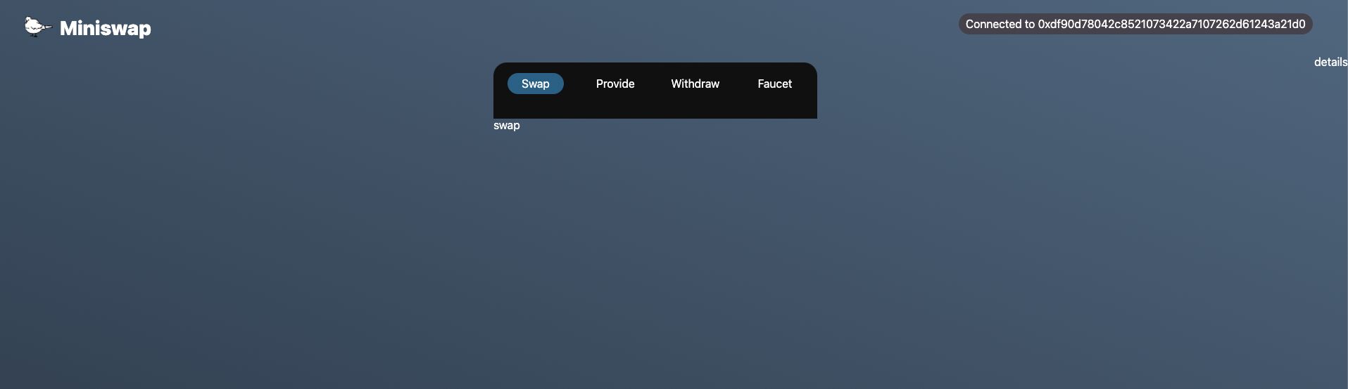
🖥️ Let’s check the screen
Run the following command in your terminal:
yarn client dev
Then open your browser and go to http://localhost:3000.
You should see a screen similar to the example image.
Switching between tabs (Swap, Provide, etc.) should change the displayed label.

Clicking the Connect to wallet button should prompt MetaMask to connect.
⚠️ Make sure your MetaMask network is set to Fuji before connecting.
After MetaMask approval, the Connect to wallet button will display your connected wallet address.
🌔 Reference Link
You can check the final completed repository for this project here.
If something isn’t working as expected, you can refer to it.
🙋♂️ Asking Questions
If you have any questions about the work so far, ask in the #avalanche channel on Discord.
To make support smoother, please include the following in your error report:
1. Section number and lesson number your question relates to
2. What you were trying to do
3. Copy & paste of the error message
4. Screenshot of the error screen
We now have the base code for the frontend! In the next lesson, we’ll connect the contract and the frontend.