lesson-2_使用するコンポーネントを作成しよう
⚙️ UI で使用するパーツを実装しよう
では早速最小単位のAtoms(原子)の実装から行なっていきましょう!
⚛ atom
それぞれボタンなどのパーツ��を作成していくことになります。ではそれぞれのファイルを下のように編集していきましょう!
それぞれファイル名の下に作成するパーツの画像が示されています。
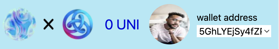
[appLogo.tsx]

UNCHAINとASTARのロゴが ✖️ マークの両端に横並びに配置されているロゴを作成します。
import Image from "next/image";
import type { FC } from "react";

const AppLogo: FC = () => {
  return (
    <div className="flex-row flex items-center ml-[5px]">
      <Image
        className="w-[50px] h-[50px]"
        src="/unchain_logo.png"
        alt="unchain_logo"
        width={30}
        height={30}
      />
      <Image
        className="w-[40px] h-[25px]"
        src="/cross_mark_2_logo-removebg.png"
        alt="cross_logo"
        width={30}
        height={30}
      />
      <Image
        className="w-[50px] h-[50px]"
        src="/Astar_logo.png"
        alt="astar_logo"
        width={30}
        height={30}
      />
    </div>
  );
};

export default AppLogo;
[balance.tsx]
こちらには選択されたアカウントの残高が入ります。
UNIの部分はトークンのsymbolとなる部分で変更していただいて構いません。

import { FC } from "react";

type Props = {
  balance: string;
};

export const Balance: FC<Props> = (props: Props) => {
  return <div className="text-2xl">{props.balance} UNI</div>;
};
[biggerProfileIcon.tsx]

※画像はそれぞれのユーザーの設定したものによって異なります。
ファイルの名前からして大きい方のプロフィールアイコンということですが、これはプロフィール画面にのみ使われるアイコンです。
import Image from "next/image";
import type { FC } from "react";

type Props = {
  imgUrl: string;
};

export const BiggerProfileIcon: FC<Props> = (props: Props) => {
  return (
    <Image
      className="rounded-full h-24 w-24 mx-2"
      src={props.imgUrl}
      alt="profile_logo"
      width={30}
      height={30}
      quality={100}
    />
  );
};
[bigInput.tsx]
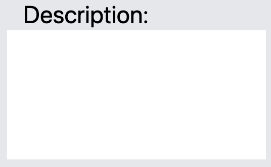
こちらは投稿をする時に、投稿内容を記述するための欄です。
import { FC } from "react";

type Props = {
  title: string;
  name: string;
};

export const BigInput: FC<Props> = (props: Props) => {
  return (
    <div className="flex flex-col items-start w-full my-4">
      <div className="mr-2 text-2xl ml-[32px]">{`${props.title}:`}</div>
      <input
        id={props.name}
        name={props.name}
        type="text"
        className="w-64 h-32 bg-white flex ml-4"
      />
    </div>
  );
};
[bottomLogo.tsx]

こちらは画面下に表示するナビゲーションバーで使用するアイコンです。ホーム画面、プロフィール画面、メッセージ画面それぞれに違うアイコンを使用するのでpropsから受け取るようになております。
import Link from "next/link";
import { Dispatch, FC } from "react";
import { IconType } from "react-icons";

type Props = {
  selectedScreen: string;
  screenName: string;
  setSelectedScreen: Dispatch<React.SetStateAction<string>>;
  icon: IconType;
};

const BottomLogo: FC<Props> = (props: Props) => {
  return (
    <Link
      onClick={() => {
        props.setSelectedScreen(props.screenName);
      }}
      href={props.screenName}
      className="flex-1 flex items-center justify-center flex-col"
    >
      <props.icon
        className={
          "h-12 w-12 " +
          (props.screenName === props.selectedScreen
            ? "fill-[#0009DC]"
            : "fill-gray-500")
        }
      />
      {props.screenName === props.selectedScreen ? (
        <div className="pb-1 text-[#0009DC]">{props.screenName}</div>
      ) : (
        <></>
      )}
    </Link>
  );
};

export default BottomLogo;
[closeButton.tsx]

投稿、プロフィールのモーダルを閉じるためのボタンです。
import { Dispatch, FC } from "react";

type Props = {
  afterOpenFn: Dispatch<React.SetStateAction<boolean>>;
};

export const CloseButton: FC<Props> = (props: Props) => {
  return (
    <button
      className="rounded-3xl h-10 w-32 bg-[#003AD0] text-white"
      onClick={() => props.afterOpenFn(false)}
    >
      Close
    </button>
  );
};
[disconnectButton.tsx]

ホーム画面に戻るためのボタンです。
import { useRouter } from "next/router";
import { FC } from "react";

const DisconnectButton: FC = () => {
  const router = useRouter();
  return (
    <button
      onClick={() => {
        router.push("/");
      }}
      className="z-10 text-xl text-white items-center flex justify-center h-14 bg-[#003AD0] hover:bg-blue-700  py-2 px-4 rounded-full mr-4"
    >
      Disconnect Wallet
    </button>
  );
};

export default DisconnectButton;
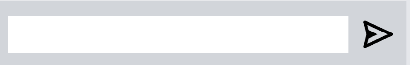
[inputBox.tsx]

投稿、プロフィール画面で画像URLを設定するための入力欄です。
import type { FC } from "react";

export const InputBox: FC = () => {
  return (
    <input
      id="message"
      name="message"
      type="text"
      className="flex-1 h-11 bg-white"
    />
  );
};
[postButton.tsx]

投稿画面で投稿するためのボタンです。
import { Dispatch, FC } from "react";
import { BsPlusLg } from "react-icons/bs";

type Props = {
  setShowNewPostModal: Dispatch<React.SetStateAction<boolean>>;
};

export const PostButton: FC<Props> = (props: Props) => {
  return (
    <button
      onClick={() => {
        props.setShowNewPostModal(true);
      }}
      className="rounded-full h-14 w-14 bg-[#003AD0] absolute bottom-24 right-1/3 mr-5 items-center flex justify-center"
    >
      <BsPlusLg className="h-9 w-9" />
    </button>
  );
};
[profileTitle.tsx]

プロフィールのタイトルとなる部分です。
import { Dispatch, FC } from "react";
import { BsGear } from "react-icons/bs";

type Props = {
  isOpenModal: Dispatch<React.SetStateAction<boolean>>;
  name: string;
};

export const ProfileTitle: FC<Props> = (props: Props) => {
  return (
    <div className="flex flex-row items-center space-x-2">
      <div className="text-2xl font-semibold">{props.name}</div>
      <BsGear
        onClick={() => props.isOpenModal(true)}
        className="fill-gray-500 h-7 w-7"
      />
    </div>
  );
};
[sendButton.tsx]

メッセージ画面の入力欄の送信ボタンです。
import type { FC } from "react";
import { BiSend } from "react-icons/bi";

export const SendButton: FC = () => {
  return (
    <button type="submit">
      <BiSend className="w-11 h-11" />
    </button>
  );
};
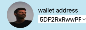
[smallerProfileIcon.tsx]

投稿やメッセージ画面のメッセージ相手の欄に使うためのアイコンです。
import { ApiPromise } from "@polkadot/api";
import { InjectedAccountWithMeta } from "@polkadot/extension-inject/types";
import Image from "next/image";
import type { FC } from "react";

import { follow } from "../../hooks/profileFunction";

type Props = {
  imgUrl: string;
  api: ApiPromise;
  actingAccount: InjectedAccountWithMeta;
  userId: string;
};

export const SmallerProfileIcon: FC<Props> = (props: Props) => {
  const implementFollow = async () => {
    if (confirm("Would you like to follow this account?")) {
      await follow({
        api: props.api,
        actingAccount: props.actingAccount,
        followedId: props.userId,
      });
    }
  };
  return (
    <Image
      onClick={implementFollow}
      className="rounded-full h-12 w-12 mx-2"
      src={props.imgUrl}
      alt="profile_logo"
      width={30}
      height={30}
      quality={100}
    />
  );
};
[smallInput.tsx]

メッセージ画面の送信欄です。
import { FC } from "react";

type Props = {
  title: string;
  name: string;
};

export const SmallInput: FC<Props> = (props: Props) => {
  return (
    <div className="flex flex-row justify-start my-4">
      <div className="mr-2 text-2xl">{`${props.title}:`}</div>
      <input
        id={props.name}
        name={props.name}
        type="text"
        className="w-24 bg-white"
      />
    </div>
  );
};
[submitButton.tsx]

プロフィール画面で画像URLと名前を設定するためのボタンです。
import type { FC } from "react";

type Props = {
  message: string;
};

export const SubmitButton: FC<Props> = (props: Props) => {
  return (
    <button
      className="rounded-3xl h-10 w-32 bg-[#003AD0] text-white"
      type="submit"
    >
      {`${props.message}!`}
    </button>
  );
};
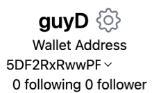
[walletAddressSelection.tsx]
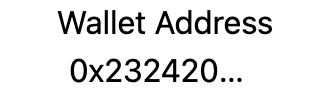
ウォレットアドレスを選択できるパーツです。
import { InjectedAccountWithMeta } from "@polkadot/extension-inject/types";
import { Dispatch, FC } from "react";
import { BsGear } from "react-icons/bs";

type Props = {
  isOpenModal: Dispatch<React.SetStateAction<boolean>>;
  name: string;
  setActingAccount: Dispatch<
    React.SetStateAction<InjectedAccountWithMeta | undefined>
  >;
  idList: InjectedAccountWithMeta[];
  setIsCreatedFnRun: Dispatch<React.SetStateAction<boolean>>;
};

export const WalletAddressSelection: FC<Props> = (props: Props) => {
  return (
    <>
      <div>Wallet Address</div>
      <div className="text-ellipsis overflow-hidden w-44 items-center flex justify-center">
        <select
          onChange={(event) => {
            props.setActingAccount(
              props.idList[Number.parseInt(event.target.value)]
            );
            props.setIsCreatedFnRun(false);
          }}
          className="w-32 items-center flex"
        >
          {props.idList !== undefined ? (
            props.idList.map((id, index) => (
              <option value={index}>{id.address}</option>
            ))
          ) : (
            <option className="text-ellipsis overflow-hidden">
              no accounts
            </option>
          )}
        </select>
      </div>
    </>
  );
};
🔮 molucule
ここからはmoluculeディレクトリ内のパーツを記述していきます。
atomsディレクトリ内のパーツを組み合わせます!
[formBox.tsx]
メッセージ画面のメッセージ送信欄のパーツです。
import type { FC } from "react";

import { InputBox } from "../atoms/inputBox";
import { SendButton } from "../atoms/sendButton";

type Props = {
  submit: (event: any) => Promise<void>;
};

export const FormBox: FC<Props> = (props: Props) => {
  return (
    <div className="bottom-0 h-20 w-full bg-gray-300 items-center flex justify-center flex-row ">
      <form
        onSubmit={props.submit}
        className="flex flex-row space-x-3 px-3 w-full"
      >
        <InputBox />
        <SendButton />
      </form>
    </div>
  );
};
[headerProfile.tsx]
プロフィール画面のサブヘッダーとなる部分のパーツです。
import Image from "next/image";
import { FC } from "react";

export type Id = {
  address: string;
};

type Props = {
  imgUrl: string;
  idList: Id[];
  setActingAccount: (id: Id) => void;
};

const HeaderProfile: FC<Props> = (props) => {
  return (
    <div className="flex-row flex items-center ml-[30px]">
      <Image
        className="w-[70px] h-[70px] rounded-full mr-3"
        src={props.imgUrl}
        alt="profile_logo"
        width={30}
        height={30}
      />
      <div className="mr-3">
        <div>wallet address</div>
        <select
          onChange={(event) => {
            props.setActingAccount(props.idList[Number(event.target.value)]);
          }}
          className="w-32"
        >
          {props.idList ? (
            props.idList.map((id, index) => (
              <option value={index}> {id.address} </option>
            ))
          ) : (
            <option className="text-ellipsis overflow-hidden">
              no accounts
            </option>
          )}
        </select>
      </div>
    </div>
  );
};

export default HeaderProfile;
[profileList.tsx]
プロフィール部分のアイコン右にある情報が書かれている部分です。
import { ApiPromise } from "@polkadot/api";
import { InjectedAccountWithMeta } from "@polkadot/extension-inject/types";
import type { Dispatch, FC } from "react";

import { ProfileTitle } from "../atoms/profileTitle";
import { WalletAddressSelection } from "../atoms/walletAddressSelection";

type Props = {
  name: string;
  isOpenModal: Dispatch<React.SetStateAction<boolean>>;
  setActingAccount: Dispatch<
    React.SetStateAction<InjectedAccountWithMeta | undefined>
  >;
  idList: InjectedAccountWithMeta[];
  setIsCreatedFnRun: Dispatch<React.SetStateAction<boolean>>;
  api: ApiPromise;
  actingAccount: InjectedAccountWithMeta;
  followingList: Array<string>;
  followerList: Array<string>;
};

export const ProfileList: FC<Props> = (props: Props) => {
  return (
    <div className="flex items-center flex-col">
      <ProfileTitle name={props.name} isOpenModal={props.isOpenModal} />
      <WalletAddressSelection
        isOpenModal={props.isOpenModal}
        name={props.name}
        setActingAccount={props.setActingAccount}
        idList={props.idList}
        setIsCreatedFnRun={props.setIsCreatedFnRun}
      />
      <div className="">{`${props.followingList.length} following ${props.followerList.length} follower `}</div>
    </div>
  );
};
🐹 organisms
ここからはorganismsディレクトリのパーツを実装していきましょう。
atomsとmoleculesのパーツを組み合わせていきます!
[footer.tsx]
画面下にあるナビゲーションバーです。

import React, { Dispatch, FC } from "react";
import { IconType } from "react-icons";
import { BiCommentEdit, BiHomeSmile, BiUser } from "react-icons/bi";

import BottomLogo from "../atoms/bottomLogo";

type Props = {
  selectedScreen: string;
  setSelectedScreen: Dispatch<React.SetStateAction<string>>;
};

type Screen = {
  name: string;
  icon: IconType;
};
const Footer: FC<Props> = (props: Props) => {
  const screenInfoList: Array<Screen> = [
    { name: "home", icon: BiHomeSmile },
    { name: "profile", icon: BiUser },
    { name: "message", icon: BiCommentEdit },
  ];
  return (
    <div className="text-xl bg-[#D9D9D9] h-20 space-x-28 flex-row items-center justify-center flex px-10">
      {screenInfoList.map((screenInfo) => (
        <BottomLogo
          selectedScreen={props.selectedScreen}
          screenName={screenInfo.name}
          setSelectedScreen={props.setSelectedScreen}
          icon={screenInfo.icon}
        />
      ))}
    </div>
  );
};

export default Footer;
[header.tsx]
それぞれの画面の上にあるヘッダーです。プロフィール画面に遷移した時はDisconnectボタンが表示されるようになっています。
import type { Dispatch, FC } from "react";

import AppLogo from "../atoms/appLogo";
import { Balance } from "../atoms/balance";
import DisconnectButton from "../atoms/disconnectButton";
import HeaderProfile from "../molecules/headerProfile";
import type { Id } from "../molecules/headerProfile";

type Props = {
  selectedScreen: string;
  imgUrl: string;
  idList: Id[];
  setActingAccount: (id: Id) => Dispatch<React.SetStateAction<string>>;
  balance: string;
};

const Header: FC<Props> = (props: Props) => {
  return (
    <div className="bg-[#ADE9F6] h-24 w-full flex items-center justify-center">
      <AppLogo />
      <div className="z-30 flex-1 flex items-center justify-center text-xl flex-col text-[#0009DC]">
        <Balance balance={props.balance} />
      </div>
      {props.selectedScreen === "profile" ? (
        <DisconnectButton />
      ) : (
        <HeaderProfile
          imgUrl={props.imgUrl}
          idList={props.idList}
          setActingAccount={props.setActingAccount}
        />
      )}
    </div>
  );
};

export default Header;
[inputGroup.tsx]
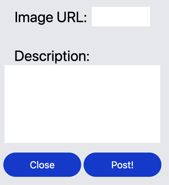
投稿画面で出てくるモーダルの入力欄のグループです。
import type { Dispatch, FC } from "react";

import { BigInput } from "../atoms/bigInput";
import { CloseButton } from "../atoms/closeButton";
import { SmallInput } from "../atoms/smallInput";
import { SubmitButton } from "../atoms/submitButton";

type Props = {
  message: string;
  submit: (event: any) => Promise<void>;
  afterOpenFn: Dispatch<React.SetStateAction<boolean>>;
};

export const InputGroup: FC<Props> = (props: Props) => {
  return (
    <form
      onSubmit={props.submit}
      className="h-1/2 w-1/5 bg-gray-200 flex flex-col items-center justify-start"
    >
      <div className="font-bold text-2xl pt-4">input post info!</div>
      <SmallInput title="Image URL" name="imgUrl" />
      <BigInput title="Description" name="description" />
      <div className="flex flex-row space-x-1">
        <CloseButton afterOpenFn={props.afterOpenFn} />
        <SubmitButton message="Post" />
      </div>
    </form>
  );
};
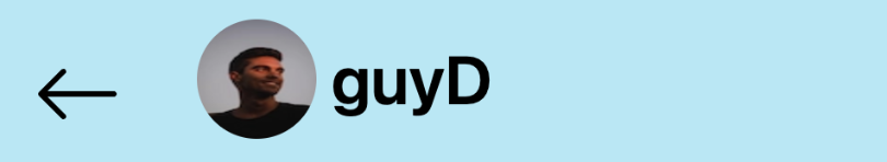
[messageBar.tsx]
メッセージ画面のヘッダーです。
import Image from "next/image";
import type { Dispatch, FC } from "react";
import { BsArrowLeft } from "react-icons/bs";

type Props = {
  userImgUrl: string;
  userName: string;
  setShowMessageModal: Dispatch<React.SetStateAction<boolean>>;
};

export const MessageBar: FC<Props> = (props: Props) => {
  return (
    <>
      <div className="bg-[#ADE9F6] h-24 w-full flex flex-row items-center justify-center">
        <Image
          className="rounded-full h-16 w-16 mx-2"
          src={props.userImgUrl}
          alt="profile_logo"
          width={30}
          height={30}
          quality={100}
        />
        <div className="font-semibold text-4xl text-ellipsis overflow-hidden w-[200px]  items-center  justify-center">
          {props.userName}
        </div>
      </div>
      <BsArrowLeft
        className="absolute top-8 left-[500px] h-12 w-12"
        onClick={() => props.setShowMessageModal(false)}
      />
    </>
  );
};
🧩 Components
ここからは実際にページで使うパーツを実装していきます。
これまで作成してきたものを組み合わせましょう!
[bottomNavigation.tsx]
画面下のナビゲーションバーです。
import { useRouter } from "next/router";
import React, { useState } from "react";

import Footer from "./organisms/footer";

export default function BottomNavigation(props: any) {
  const router = useRouter();
  const [witchScreen, setWitchScreen] = useState(
    router.pathname.replace(/[/]/g, "")
  );

  return (
    <Footer selectedScreen={witchScreen} setSelectedScreen={setWitchScreen} />
  );
}
[message_member.tsx]

メッセージ画面でメッセージ相手の名前、画像、最後のメッセージが載せてあるリストです。
import Image from "next/image";
import React from "react";

export default function MessageMember(props: any) {
  return (
    <div
      className="flex flex-row border-b-2 border-[#CECECE] w-full items-center"
      onClick={() => {
        props.setShowMessageModal(true);
        props.setUserName(props.name);
        props.setUserImgUrl(props.img_url);
        props.setMessageListId(props.messageListId);
        props.setMessageList(props.messageList);
        props.setMyUserId(props.myUserId);
      }}
    >
      <Image
        className="rounded-full h-12 w-12 mx-2"
        src={props.img_url}
        alt="profile_logo"
        width={1000}
        height={1000}
        quality={100}
        onClick={() => props.setShowMessageModal(true)}
      />
      <div className="flex items-start justify-center flex-col py-1">
        <div className="text-xm">{props.name}</div>
        <div className="text-xl">{props.last_message}</div>
      </div>
    </div>
  );
}
[message.tsx]

メッセージルームで表示される1つのメッセージです。自分か相手のメッセージかで右側と左側どちらに表示されるかが切り替わるようになっています。
import Image from "next/image";
import React from "react";

export default function Message(props: any) {
  const is_me = props.senderId == props.account_id;
  return is_me ? (
    <div className="w-full justify-end items-end flex mt-3 mb-1">
      <div className="flex-row items-end flex">
        <div className="mr-1">{props.time}</div>
        <div className={`mt-3`}>
          <div className="flex-row flex items-center">
            <div className="bg-blue-500 py-1 px-3 rounded max-w-[230px]">
              <div>{props.message}</div>
            </div>
            {is_me ? (
              <div className="border-t-transparent border-b-[10px] border-b-transparent border-l-[20px] border-l-blue-500"></div>
            ) : null}
          </div>
        </div>
        <div className="h-full flex-1 flex-col justify-start">
          <Image
            className="rounded-full h-10 w-10 mx-2 items-center"
            src={props.img_url}
            alt="profile_logo"
            width={30}
            height={30}
            quality={100}
          />
        </div>
      </div>
    </div>
  ) : (
    <div className="w-full justify-start items-end flex mt-3 mb-1">
      <div className="flex- flex items-center">
        <Image
          className="rounded-full h-10 w-10 mx-2 items-center"
          src={props.img_url}
          alt="profile_logo"
          width={30}
          height={30}
          quality={100}
        />
        <div className="flex-row flex items-end justify-start">
          <div className={`mt-3`}>
            <div className="flex-row flex  items-center">
              <div className="border-t-transparent border-b-[15px] border-b-transparent border-r-[20px] border-r-blue-500 "></div>
              <div className="bg-blue-500 py-1 px-3 rounded max-w-[230px]">
                <div>{props.message}</div>
              </div>
            </div>
          </div>
          <div className="ml-1">{props.time}</div>
        </div>
      </div>
    </div>
  );
}
[messageRoom.tsx]
メッセージルームでメッセージが表示されるパーツです。
import { ApiPromise } from "@polkadot/api";
import { InjectedAccountWithMeta } from "@polkadot/extension-inject/types";
import Image from "next/image";
import React, { Dispatch } from "react";
import { BsArrowLeft } from "react-icons/bs";

import { InputBox } from "../components/atoms/inputBox";
import { SendButton } from "../components/atoms/sendButton";
import { FormBox } from "../components/molecules/formBox";
import { MessageBar } from "../components/organisms/messageBar";
import { sendMessage } from "../hooks/messageFunction";
import type { MessageType } from "../hooks/messageFunction";
import Message from "./message";

type Props = {
  api: ApiPromise;
  actingAccount: InjectedAccountWithMeta;
  messageListId: string;
  userImgUrl: string;
  userName: string;
  messageList: Array<MessageType>;
  setShowMessageModal: Dispatch<React.SetStateAction<boolean>>;
  myUserId: string;
  myImgUrl: string;
};

export default function MessageRoom(props: Props) {
  const submit = async (event: any) => {
    event.preventDefault();
    await sendMessage({
      api: props.api,
      actingAccount: props.actingAccount,
      message: event.target.message.value,
      id: props.messageListId,
    });
    event.target.message.value = "";
  };

  return (
    <div className="flex justify-center items-center bg-gray-200 w-screen h-screen ">
      <main className="items-center h-screen w-1/3 flex bg-white flex-col">
        <MessageBar
          userImgUrl={props.userImgUrl}
          userName={props.userName}
          setShowMessageModal={props.setShowMessageModal}
        />
        <div className="flex-1 overflow-scroll w-full">
          {props.messageList.map((message) => (
            <div>
              <Message
                account_id={props.myUserId}
                img_url={
                  props.myUserId == message.senderId
                    ? props.myImgUrl
                    : props.userImgUrl
                }
                time={message.createdTime}
                message={message.message}
                senderId={message.senderId}
              />
            </div>
          ))}
        </div>
        <FormBox submit={submit} />
      </main>
    </div>
  );
}
[post.tsx]

投稿内容が表示されるパーツです。投稿内容や作成日時が表示されることになります。
import Image from "next/image";
import React from "react";
import { AiFillHeart } from "react-icons/ai";

import { addLikes } from "../hooks/postFunction";
import { SmallerProfileIcon } from "./atoms/smallerProfileIcon";

export default function Post(props: any) {
  return (
    <div className="px-3 items-center border-b-2 py-1 ">
      <div className="flex flex-row justify-center">
        <SmallerProfileIcon
          imgUrl={props.user_img_url}
          api={props.api}
          actingAccount={props.actingAccount}
          userId={props.userId}
        />
        <div className="flex items-center flex-col w-[400px]">
          <div className="flex flex-row items-center w-full ">
            <div className="mr-3 font-semibold text-xl">{props.name}</div>
            <div className="text-gray-400">{props.time}</div>
          </div>
          <div className="text-xl w-full">{props.description}</div>
          <Image
            className="mr-3"
            src={props.post_img_url}
            alt="profile_logo"
            width={250}
            height={250}
            quality={100}
          />
          <div className="flex flex-row w-full pl-[85px] items-center">
            <div className="text-xl mr-1">{props.num_of_likes}</div>
            <AiFillHeart
              onClick={() => {
                addLikes({
                  api: props.api,
                  actingAccount: props.actingAccount,
                  postId: props.postId,
                });
              }}
              className="fill-[#FD3509] h-[30px] w-[30px]"
            />
          </div>
        </div>
      </div>
    </div>
  );
}
[postModal.tsx]

投稿画面で表示される投稿作成モーダルです。
import { ApiPromise } from "@polkadot/api";
import { InjectedAccountWithMeta } from "@polkadot/extension-inject/types";
import { Dispatch } from "react";
import Modal from "react-modal";

import { releasePost } from "../hooks/postFunction";
import { InputGroup } from "./organisms/inputGroup";

type Props = {
  isOpen: boolean;
  afterOpenFn: Dispatch<React.SetStateAction<boolean>>;
  api: ApiPromise;
  actingAccount: InjectedAccountWithMeta;
};

export default function PostModal(props: Props) {
  const submit = async (event: any) => {
    event.preventDefault();
    await releasePost({
      api: props.api,
      actingAccount: props.actingAccount,
      description: event.target.description.value,
      imgUrl: event.target.imgUrl.value,
    });
    props.afterOpenFn(false);
    alert(
      `Image URL: ${event.target.imgUrl.value}\nDescription: ${event.target.description.value}`
    );
  };
  return (
    <Modal
      className="flex items-center justify-center h-screen"
      isOpen={props.isOpen}
    >
      <InputGroup
        message="Post"
        submit={submit}
        afterOpenFn={props.afterOpenFn}
      />
    </Modal>
  );
}
[profileSettingModal.tsx]
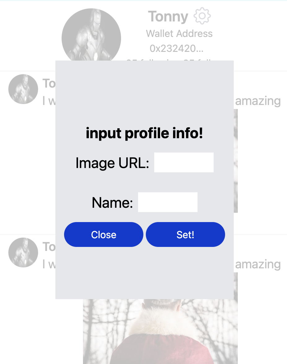
プロフィール画面で画像URLと名前を設定するモーダルです。
import { ApiPromise } from "@polkadot/api";
import { InjectedAccountWithMeta } from "@polkadot/extension-inject/types";
import React, { Dispatch } from "react";
import Modal from "react-modal";

import { getProfileForProfile, setProfileInfo } from "../hooks/profileFunction";

type Props = {
  isOpen: boolean;
  afterOpenFn: Dispatch<React.SetStateAction<boolean>>;
  api: ApiPromise | undefined;
  userId: string | undefined;
  setImgUrl: Dispatch<React.SetStateAction<string>>;
  setName: Dispatch<React.SetStateAction<string>>;
  actingAccount: InjectedAccountWithMeta | undefined;
};

export default function ProfileSettingModal(props: Props) {
  const submit = async (event: any) => {
    event.preventDefault();
    await setProfileInfo({
      api: props.api!,
      actingAccount: props.actingAccount!,
      name: event.target.name.value,
      imgUrl: event.target.img_url.value,
    });
    await getProfileForProfile({
      api: props.api,
      userId: props.actingAccount?.address,
      setImgUrl: props.setImgUrl,
      setName: props.setName,
    });
    props.afterOpenFn(false);
    alert(
      `img_url: ${event.target.img_url.value}\nname: ${event.target.name.value}`
    );
  };
  return (
    <Modal
      className="flex items-center justify-center h-screen"
      isOpen={props.isOpen}
    >
      <form
        onSubmit={submit}
        className="h-1/2 w-1/5 bg-gray-200 flex flex-col items-center justify-center"
      >
        <div className="font-bold text-2xl pt-4">input profile info!</div>
        <div className="flex flex-row justify-start my-4">
          <div className="mr-2 text-2xl">Image URL:</div>
          <input
            id="img_url"
            name="img_url"
            type="text"
            className="w-24 bg-white"
          />
        </div>
        <div className="flex flex-row justify-start my-4">
          <div className="mr-2 text-2xl">Name:</div>
          <input id="name" name="name" type="text" className="w-24 bg-white" />
        </div>
        <div className="flex flex-row space-x-1">
          <button
            onClick={() => props.afterOpenFn(false)}
            className="rounded-3xl h-10 w-32 bg-[#003AD0] text-white"
          >
            Close
          </button>
          <button
            className="rounded-3xl h-10 w-32 bg-[#003AD0] text-white"
            type="submit"
          >
            Set!
          </button>
        </div>
      </form>
    </Modal>
  );
}
[profileSubTopBar.tsx]

プロフィール画面のサブヘッダーです。
import { ApiPromise } from "@polkadot/api";
import { InjectedAccountWithMeta } from "@polkadot/extension-inject/types";
import React, { Dispatch } from "react";

import { BiggerProfileIcon } from "./atoms/biggerProfileIcon";
import { ProfileList } from "./molecules/profileList";

type Props = {
  imgUrl: string;
  name: string;
  isOpenModal: Dispatch<React.SetStateAction<boolean>>;
  setActingAccount: Dispatch<
    React.SetStateAction<InjectedAccountWithMeta | undefined>
  >;
  idList: InjectedAccountWithMeta[];
  setIsCreatedFnRun: Dispatch<React.SetStateAction<boolean>>;
  api: ApiPromise;
  actingAccount: InjectedAccountWithMeta;
  followingList: Array<string>;
  followerList: Array<string>;
};

export default function ProfileSubTopBar(props: Props) {
  return (
    <div className="flex flex-row mt-2 border-b-2 w-full items-center justify-center">
      <BiggerProfileIcon imgUrl={props.imgUrl} />
      <ProfileList
        name={props.name}
        isOpenModal={props.isOpenModal}
        setActingAccount={props.setActingAccount}
        idList={props.idList}
        setIsCreatedFnRun={props.setIsCreatedFnRun}
        api={props.api}
        actingAccount={props.actingAccount}
        followingList={props.followingList}
        followerList={props.followerList}
      />
    </div>
  );
}
[topBar.tsx]
それぞれの画面で表示されるヘッダーです。
import { useRouter } from "next/router";
import React from "react";

import Header from "./organisms/header";

export default function TopBar(props: any) {
  const router = useRouter();
  const selectedScreen = router.pathname.replace(/[/]/g, "");
  return (
    <Header
      selectedScreen={selectedScreen}
      imgUrl={props.imgUrl}
      idList={props.idList}
      setActingAccount={props.setActingAccount}
      balance={props.balance}
    />
  );
}
これで間接的に使用するパーツの作成は完了しました!
わからないことがあれば、Discordの#astarでsection・Lesson名とともに質問をしてください 👋
🙋♂️ 質問する
次のセクションではページに直接使用するパーツを記述して行きましょう! 🎉